DISCLAIMER
The draft recommendations contained herein were preliminary drafts submitted for discussion purposes only and do not constitute final determinations. They have been subject to modification, substitution, or rejection and may not reflect the adopted positions of IFATCA. For the most current version of all official policies, including the identification of any documents that have been superseded or amended, please refer to the IFATCA Technical and Professional Manual (TPM).
54TH ANNUAL CONFERENCE, Sofia, Bulgaria, 20-24 April 2015WP No. 82Screen Design ProcessPresented by PLC and TOC |
Summary
The development of new ATS systems allows the introduction of new technologies. Colour displays and automated warnings are but some of them, as well as the layout of Controller Working Positions. If not carefully assessed and tuned they bear their own risks. This paper is discussing the various aspects of the screen design process, points out risks associated with immature introduction and looks at possible solutions to avoid unwanted effects.
Introduction
1.1. Modern ATM systems have vast capabilities compared to those previously in use. The growing demand for increased system capacity are leading to the introduction of new automation. This automation can overcome human cognitive limits or support the controller, but can at the same time lead to additional complexity in the ATC task management.
1.2. Generally, Controller Working Positions (CWP) have developed via an incremental and non-uniform process. With components supplied by different vendors, the equipment interfaces are often dissimilar and not integrated. Though technical compatibility must be ensured, there are often inconsistencies in the Human-Machine Interface (HMI).
1.3. Although many studies on screen design optimization have been performed over the year, and a clear ‘cockpit design philosophy’ exists, a standard regarding HMIs specifically for Air Traffic Services is still lacking.
1.4. MA’s report mixed results on the outcome of the implementation of new support tools or ATC systems. This paper gives an overview of the existing guideline material and the main aspects to be taken into account in a Screen Design Process.
Discussion
2.1. The modification of the Controller Working Position (CWP) has become one of the most visible and critical activities in the upgrade of the ATM system. Successful introduction of such an upgrade involves the integration of operational, technical and human factors expertise.
2.1.1. There often is a gap between the manufacturers (engineers) and the front-end users (air traffic controllers). Although an iterative approach (spiral model – for more information see IFATCA WP No. 87 “Determining Operations Readiness of Automated ATM Systems”) is preferable, human factors are often considered too late in the design of new systems. These late considerations often lead to adjusting the model to provide the desired outcome or so- called ‘reverse engineering’, with negative consequences on the basic design. An agile design model, in which front-end users are looped in every phase of the process, helps getting a better understanding of how the realized vision would operate in a real world concept and lowers the chances of surprises arising down the road (“Understanding Agile Design and why it’s important” – Luke Clum, June 2013). The main pitfall is the assumption that since humans are so flexible and adaptable, it’s easier to let them adapt themselves to the machine than vice versa. It is therefore important to continue to urge the need for controllers to be involved in the design process.
2.1.2. At the IFATCA conference in Kathmandu 2012 a paper was presented on “Determining Operations Readiness of Automated ATM Systems”. This paper describes several cases in which controllers have been involved in the development of the system and compares those with cases in which ATCOs worked with already developed systems. In those cases where operational staff had been included in the development process, system changes were better accepted by the concerned ATCOs and (partial) redesigns were not deemed necessary.
The following policy was adopted at the Conference:
Operational controllers shall be involved in the design, development and implementation of new ATM systems. Their role should include:
(IFATCA WP 87 – Resolution B12 – Kathmandu 2012) |
This policy connects to earlier adopted policy, which states:
| Automation must improve and enhance the data exchange for controllers. Automated systems must be fail-safe and provide accurate and incorruptible data. These systems mu be built with an integrity factor to review and crosscheck the information being received.The Human Factors aspects of Automation must be fully considered when developing automated systems.
Automation must assist and support ATCOs in the execution of their duties. (IFATCA Technical and Professional Manual 2014, page 4.2.1.15) |
2.1.3. Although IFATCA has several general policies on requirements for design standards for automated systems, there is no uniformity or consistency in system design. Over the years, several researches have been done on the human factors in system design, colour use etc. But, in contrast to the design of cockpits, common principles for alerts and the display of operational information specifically for Air Traffic Services are still lacking.
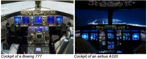
2.1.4. Nowadays cockpits present similar interfaces and equipment and functionalities are highly standardized. The introduction of a fly-by-wire cockpit had adhered to a set of design rules and guidelines for cockpit design. These design rules include for example that the cockpit should simplify the pilot’s task by enhancing situational and system awareness, with automation assisting the aircrew by achieving tactical tasks that it can perform better than a human operator. The automated systems are designed to complement the aircrew, and are not intended to challenge their role and responsibility. Furthermore the process used for system design includes human factor considerations that help minimize the potential for pilot error.
2.1.5. There are no official standards and requirements available for the design of ATC systems. The chosen design is often ANSP specific. There is a high diversity in interfaces and different protocols are used in the design. Standards, design and procedures used are non-standard which could counteract interoperability. Several ANSPs are changing their facilities in different times and in different ways.
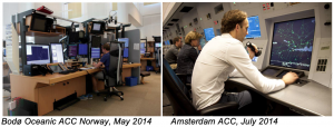
2.1.6. It seems there is a lack of interest amongst ATM system developers’ industry to develop such standards. As one ANSP explains, in this way the supplier will offer his own “standard”. Any changes an ANSP would like to have implemented is usually available at additional charge. Not only is this pointing towards an economic interest against any standardisation, it could also be disadvantageous for ANSPs who don’t have the expertise and ability to set requirements for the supplier.
2.1.7. Some stakeholders developed their own guidelines or standards for system design. In December 2002 the Eurocontrol Core Requirements for ATM Working Positions (CoRe) Project was finalized. This project was created to identify and mitigate problems within the Controller Working Position Development Process. The Style Guide that was produced provides a style philosophy, which provides a general direction from which style details emerge and takes into account the general human requirements arising from this philosophy.
2.1.8. The FAA produced the Human Factors Design Standard (HFDS) for Acquisition of Commercial Off-The-Shelf Subsystems, Non-Developmental Items, and Developmental Systems in May 2003. This report converts a previous guidelines document into standards that assist in e.g. the design, development and evaluation of FAA systems and equipment. It provides comprehensive guidance on 15 different areas, including alarms, computer-human interface, workstation and workplace design.
2.1.9. The so-called “Common Controller Cockpit” is a standardised working position for ATCOs, which is part of the Virtual Centre Model. This Virtual Centre Model is an idea within the European Air Navigation Service industry, in which a group of air traffic service units, operating from different locations, use fully standardised methods of operation, information, procedures, technical means and equipment. In a Common Controller Cockpit the controller’s workstation, the architecture, its functionalities and the related procedures will be fully standardised in order to permit common working processes. This could facilitate the establishment of cross-border service provision.
2.1.10. A standardization among system design and ATC applicable guidelines would allow system developers to reuse the lessons learned from the past and could reduce the chance of human error. Furthermore it would increase the flexibility and benefit in the interoperability of the overall ATC system. Possible cultural differences should always be taken into account when developing such standardizations.
2.2. Over the years, scores of generic guidelines have been created. Although not all of these guidelines are particularly ATC related, but as they are applicable on all displays in various functions, they are valid for ATC as well.
2.2.1. General design requirements can be divided in four different areas of concern. Simplicity, Consistency, Safety, and Usability should be taken into account.
2.2.2. Simplicity
A system design should be as simple as possible. Equipment designed with simplicity in mind is generally more reliable and easier to maintain and operate. Simple design usually has less potential for human error and could decrease the amount of training needed to operate on a system. Since users rely on the system’s information, it is important that the validity of the data, the way the data is processed and the limitations of the system are well understood.
2.2.3. Consistency
Consistent system design adheres to the same principles with minimum variation. Although integrated displays are always preferable when a variety of data is needed to be displayed, there are certain factors that make this impossible. In these cases, the displays used should be as consistent as possible; the extent of inconsistency should be minimised. This means that the same layout and style should be used as much as possible, e.g. support screens that have the same background as main screens. Furthermore identical interfaces should have identical functions, colour schemes and layout of the screens should be similar and terminology should be standardised so that there’s no difference in the names assigned to a function or feature.
Consistency for instance leads to a faster information processing; studies have shown that the length of time it takes a user to mentally process the comments on a screen nearly doubles when the position of the screen elements is varied (Teitelbaum & Granda (1983)).
2.2.4. Safety
As in every system design process, a new designed ATC system should be verified, validated and certified. An important part is that a safety check is not only done on the technical side of the system (is the system stable enough to work on?) but also on the Human Factor side. Is the new design workable, how does the new layout affect the ATCO and is capacity proportional or increased without safety issues? This should be done for normal, degraded and emergency situations.
The previously adopted IFATCA policy on this subject can still be considered as valid.
| When designing and introducing new ATM-equipment the vulnerability and possible abuse of this equipment should be considered, and precautionary measures should be taken. (IFATCA Technical and Professional Manual 2014, page 4.2.1.17) |
| MAs should encourage their State’s Regulatory Authority to play a role in the development and certification/ commissioning and oversight during the life cycle of air traffic control equipment. (IFATCA Technical and Professional Manual 2014, page 4.2.1.18) |
2.2.4.1. A system should not only be stable and well designed, but should also be as little error prone as possible; the possible amount of errors made by the user should be minimised. In the Baseline Exemplary Guide, published by the CoRe Project, the responsible interface style is mentioned. This is an interface that encourages the user to give considerations to inputs, which might have an operational significance, before they are made. In the case that an action leads to a change of information to another party, or when severe system changes are made (e.g. entering a back-up mode), an UNDO- function might not be sufficient.
2.2.5. Usability
The usability of a system is determined by the ease of use for the ATCO. A so-called User-Centred Perspective Design can achieve the best usability. A design with a User-Centred Perspective is similar to the previously mentioned cockpit design strategy; it focuses on the needs and requirements of the end user throughout the design, acquisition or development process. The process also continues after the system is delivered in order to further optimise the design and user satisfaction.
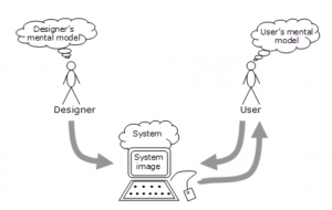
2.2.5.1. Human beings learn how to deal with certain situations and systems by using so-called mental models (“The mind constructs ‘small-scale models’ of reality that it uses to reason, to anticipate events and to underlie explanation” – Kenneth Craik, The Nature of Exploration, 1943). This knowledge tells them how to use the system (what to do next?) and what to do with unfamiliar systems (how does it work?). This involves both conscious and unconscious processes, whereupon people draw conclusions of how to work a system and why a system acts the way it does. If the mental model of the designer (what do I want to achieve?) differs from the mental model of the user (what do I want the system to do?), a discrepancy arises. This could cause misunderstanding and rejection, followed by possible safety issues.
2.2.5.2. There are several factors contributing to the usability of screens and systems. In psychology several so-called “core cognitive aspects” can be marked. These cognitive aspects are a set of mental abilities and processes, which define the way people process information. Three of these aspects (Attention, Perception&Recognition and Memory&Working memory) have an influence on screen design.
2.2.6. Although most information on an ATC screen is critical, some warnings and alerts need direct focus and attention. These warnings can be made noticeable in either aural or visual way. The extent to which certain warnings are displayed should be well thought of. Well-designed warnings and alerts on a screen definitely contribute to safety, however if nuisance alerts and false warnings occur too frequently, this could lead to a neglect, which would cause a direct safety issue. The parameters for such warning systems should be set in such a way that the risk of nuisance alerts is minimised. Studies have shown that nuisance alerts are extremely distractive to the primary task of an ATCO, since it always has to be determined immediately whether the alert is necessary, important, and/or helpful. After this determination there is also a “resumption lag”; the time it takes for an ATCO to resume the normal task flow (Altmann & Trafton, 2002).
2.2.6.1. Aural warnings can immediately raise awareness of a possible problem. Additionally it enables the environment to contribute to problem solution. On the downside aural warnings contribute to higher noise levels in the operations environment. They could cause annoyance from the “disturbance” from other working positions. Aural warnings should therefore be used selectively and should be appropriately designed and prioritised. An aural STCA warning can be very distinctive, but therefore also a trigger for colleagues to check if something is done about a potentially unsafe situation. If such a priority would also be given to routine alerts like e.g. estimate discrepancies, this would become an unwelcome distraction.
2.2.6.2. Visual warnings are feasible in various ways. In cockpit design, the so-called quiet/dark philosophy is used. This design philosophy states that information is not displayed until something goes wrong. This way an abnormal situation will be instantly noted. This concept can also be used in ATC. The colour of a label (or part of it), the writing (size, font, bold), or the symbol for the respective flight(s) could be changed (e.g. the target symbol changes, a symbol is added to the label, the label is framed). Among visual warnings, the extent to which they are implemented can also differ and should be well considered, depending on the importance of the alert.
2.2.6.3. Some ATC systems have multiple warning renditions built-in to warn the ATCO of a possibly unwanted or unsafe situation. Apart from the essential Conflict Alert tools, systems might also display warnings such as Callsign Confusion warnings, Hand-Off warnings and restricted areas warnings. Improvident implementations of such systems could cause an increase of workload for a controller since it might be difficult to determine the nature of the warning.
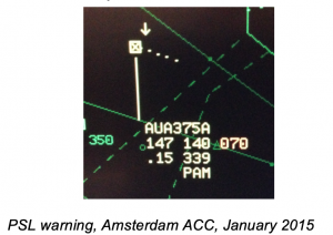
2.2.6.4. On the other hand, well-designed warnings contribute to safety. The implementation of so-called PSL-warnings (Pilot Selected Level-warnings – The Pilot Selected Level is downlinked from the aircraft’s mode S and then compared to the cleared flight level input by the controller. If a discrepancy is found, a warning is shown. This is not uplinked to the aircraft) for example reduced the possibility of level busts. In case of a discrepancy between the PSL and the cleared flight level according to the system, the Pilot Selected Level is shown in red next to the cleared flight level entered by the controller.
2.2.6.5. Salient colours are often used to capture attention to information, which needs to be attended to immediately, such as warnings. Generally used colour codes (red for alert and yellow/orange for caution), exclusively used for this purpose prevents confusion and possible neglect.
2.2.7. The Perception and Recognition aspect is about how information is acquired and processed. Adjusting obvious design implications such as legibility, structure and filtering can best optimise this aspect.
2.2.7.1. Studies have shown that the characteristics of display formats affect how well users can extract information from displays. Variety (is the information categorized or mixed) and numeric size (the amount of information displayed) for example, contribute to the complexity of a display.
When defining complexity, two different parts have to be taken into account; information complexity and cognitive complexity. Information complexity described the complexity from the perspective of the system. Graphics and text are discussed. Cognitive complexity focuses on the observer, the user of a system. Since ATC involves many cognitive tasks (such as resolving conflicts and monitoring situations), it’s important to measure the cognitive complexity. Automation is supposed to reduce workload so the cognitive complexity should be lowered.
2.2.7.2. Screens should be designed in a way that minimises eye movement. The information on a screen should be presented in a simple and well-organised manner. To integrate as much information on a screen as possible, the concept of toggling could be considered. Toggling makes a user able to turn certain information displays on or off so ATCOs can get the right information when this is needed.
2.2.7.3. The way information is displayed and the amount of information shown also contributes to the conspicuousness. The information displayed should be prioritized so that the most and critical information is displayed all the time. Showing information which is non- critical could create an information overload for the controller.
Not only showing non-critical information, when this is information which isn’t directly needed for the task, can cause an overload for the controller. Also information that can’t be filtered can hinder. When controllers are only working in a certain altitude range, it might be useful to filter out traffic above or below their own sector to prevent screen clutter. With traffic at all altitudes being displayed on a radar screen, it could become difficult to keep track of the applicable traffic.
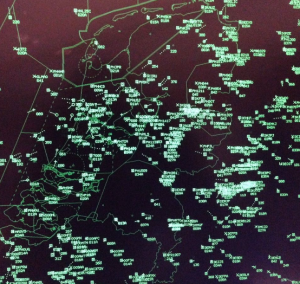
Flight Information without height filters. Radar screen of Amsterdam Flight information without height filters.
When legibility is taken into consideration, several aspects should be taken into account. At the Amman Conference in 2010, a review on the Policy on Alpha-Numeric Call Signs was presented.
The following policy was accepted:
| “A universally applicable system for the use of alpha-numeric call signs should be developed. This system should consider at least the following requirements;[…]
– alpha numeric call signs shall not comprise of the letters B, I, O, S and Z in the flight identification because of the potential visual confusion with 8, 1, 0, 5 and 2.” |
Since the use of such potentially confusing characters can increase workload and error potential, the use should still be highly discouraged.
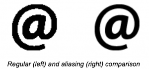
2.2.7.5. Legibility can be further increased by the use of techniques such as anti-aliasing, a technique in which the “boundaries” between two different colours are smoothened so graphics become less granular. Although ATC screens contain mostly typography, fonts and symbols can ease the readability.
2.2.8. Colour use does not only attract attention when correctly used, it also has an impact on the recognition. Although it seems like dark background is still most often used in ATC, the German Karlsruhe centre introduced a new system with a white background in 2010. The training sessions for the new system (VAFORIT) showed that ATCOs did not accept the new design. Attempts to change the colours showed that each change to one colour affected another as well as the whole design.
After the introduction of VAFORIT the colour scheme was seen as a contributory factor to several incidents and was in need of improvement. The Institute for Labour Sciences (IAD) of Darmstadt University got called in for assistance. For the first time a scientific analysis was done, which was developed into a concept, taking into account the existing hardware. A major aspect found was that the colour distances needed to be equidistant from each other (see diagram and explanation below). This conceptual approach was well taken by the ATCOs, who saw the benefits.
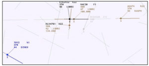
1) Original colour scheme VAFORIT; black: on frequency; brown: on next frequency; black/brown: send status; blue: expected traffic; brown tended to get lost from view.
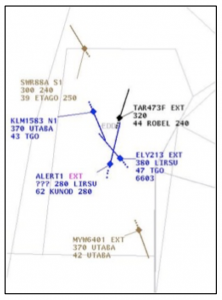
2) Colour scheme after first change; after a first change yellow was changed t pink as a warning colour; the background colour was turned to clear white.
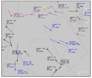
3) Latest colour schema after IAD study; yellow is now a first step warning colour, also for system warnings; “raspberry” colour replaced the former brown; the background is now light grey.
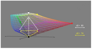
4) Examples for colour distances the diagram is showing distances between individual colours;
it was proven that the distances should ideally be equidistant in the grid; e.g. the clear white
at the very top was too distant from the other colours.
2.2.9. The colour use can also affect the memory aspect. A human being cannot remember everything, the brain uses processes such as filtering in order to organise all information. Instead of remembering every single piece of information, the brain creates links and “folders” of information, which can be traced when it gets a new stimulus. This subconscious process make that it is easier for human beings to recognize than to recall certain information. Since the immediate memory capacity of a human being is limited, the use of strips or label inputs are necessary to keep track of the clearances given or information provided.
2.2.10. Several centres use colour codes or symbols to get a clear image of the stage a flight is in. Although this can be a perfect mnemonic and information source, it could also cause overload for controllers in heavy traffic situations. An example of a selection of the used colours from the Belgian ACC department:
White – ACFT is currently on the frequency
Yellow – ACFT is coordinated to enter the sector
Brown – ‘Redundant’ traffic, ACFT is transferred to the next sector
Green – ACFT should be entering the sector but is not yet under control
Blue – ACFT is selected/highlighted
Red – Conflicting ACFT
Grey – Information label, ACFT won’t necessarily be entering the sector.
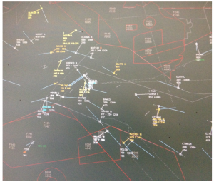
In this case all the colours used make it difficult for the controller to keep track of the traffic. Furthermore the grey ‘information’ labels are often overlooked due to all the other colours. However, there are also situations reported in which colour differentiation is preferable and an actual outcome of a safety assessment. A differentiation in colour use for inbound and outbound traffic for example (used in Zurich Approach for instance; outbounds are coloured cyan, while inbounds are coloured green) gives an immediate overview of the traffic streams. If used correctly and sensibly, colour usage can be an asset.
2.2.12 There is no standardisation in colour usage. This might be difficult to achieve, as colour perception, meanings and preferences vary by culture and ethnicity (Colour: Cross Cultural Marketing Perspectives as to what governs our response to it, Sable / Akcay 2010). Finding a colour setting that suits every culture all over the world could prove very challenging.
It could be achievable to develop a colour vision standard for Air Traffic Control based on previously published generic guidelines. Although according to Swiss psychologist Carl Jung “Millions of years of knowledge are stored in the genetic building plan of our brain. Throughout human life the individual refines this building through experience and learning”. However, it is clear from all the information obtained that people cross-culturally attach meanings to colours, which transcend cultural boundaries (Culture and Color: https://alslectures.webs.com/cultureandcolor.htm).
This would ensure that colour distances as a standard will match the respective priorities, e.g. purple must not be too close to red in order to keep it distinguishable.
2.3. Most ACCS, APPs and TWRs have had their own experience with the HMIs in use and especially new HMIs to be introduced with the latest system technology. Often units are taking different approaches, even within the same ANSP. Taking advantage of lessons learnt would seem to be the most natural step, but for various reasons, e.g. tradition, this only happens rarely. The economic pressure stemming from the SES might be a chance to improve this point.
2.4. As a general rule it can be summarised, that the HMI needs to be looked at in an iterative approach. This includes the operations room, the controller workstation, the HMI, layout and colour scheme, lighting and the prevailing hardware. Every part needs to be seen as a cog in the machine. Each detail being changed has an influence on the whole, and as such needs to be regarded as a complete system.
Other lessons learnt from previous experiences:
- Screen technology has to be considered when designing colours
- In order to ensure the same colours on every screen, these might need to be calibrated
- Screens need to be monitored with respect to aging problems
- Colour distances need to be considered
- Reflections have to be eliminated as far as possible
- Support screens require the same background as the main screen
- Colour code and colour scheme have to be the same on all screens
- Control room lighting and the environment, screen background, colours are interdependent
Experiences made in one unit – esp. within the same ANSP – should be made available and used in all other units with the unavoidable limitations.
Conclusions
3.1. Successful introduction of any upgrade or renewal in the ATM system involves the integration of operational, technical and human factors expertise. Operational controllers shall be involved in the design, development and implementation of new ATM systems.
3.2. Although many studies on screen design optimization have been performed over the year, and a clear ‘cockpit design philosophy’ exists, a standard regarding HMIs specifically for Air Traffic Services is still lacking.
3.3. A User-Centred approach in which Safety, Consistency and Usability are taken into account is deemed necessary for a successful introduction of new ATM systems.
3.4. Visual and Aural warnings can contribute to safety, if correctly implemented; nuisance alerts can cause neglect and distraction.
3.5. Filtering, toggling, optimized readability and simplicity contribute to an optimized usability.
3.6. The need to memorize information should be minimized, however additional tools to support the controller should not cause an increase of workload.
3.7. All participants in the development and maintenance of an ATM system and it’s HMI need to be aware that a iterative approach is the best way to achieve the desired result.
Recommendations
4.1. It is recommended:
To task the EB to develop principles for alerts and the display of operational information.
References
IFATCA Technical and Professional Manual, 2014.
Human Factors Design Standard (FAA-HF-STD-001A) – FAA, 2003.
Baseline Exemplary Style Guide, CoRe Project – Eurocontrol, 2004.
Color Analysis in Air Traffic Control Displays, Part I. Radar Displays – Jing Xing, FAA, 2006.
Air Traffic Control Display Standard: A Standardized Color Palette for Terminal Situation Displays – Friedman-Berg, Allendoerfer & Pai, FAA, 2008.
Complexity and Automation Displays of Air Traffic Control: Literature Review and Analysis – Xing & Manning, FAA, 2005.
Colour: Cross Cultural Marketing Perspectives as to what governs our response to it, Sable / Akcay 2010.
Colours Across Cultures: Translating Colours in InteractiveMarketing Communications Mario De Bortoli & Jesús Maroto, 2001.
“A safety and human centered approach to developing new Air Traffic Management Tools” – Nancy Leveson et al. ATM 2001, Albuquerque.
Understanding Design Philosophy – 4th Global Flight Safety and Human Factor Symposium, Santiago Chile, April 1999.
Human Factor Design Guidelines for Multifunction Displays – Mejdal & McCauley, FAA, October 2001.
SESAR Human Performance Reference Material – Guidance (Deliverable D26, Edition 00.01.01) – SESAR 2013.
The Virtual Centre Model – Skyguide, April 2013.
National Airspace System Enterprise Architecture (NAS EA), Technical Standards Profile and Forecast (TV-1/2) Version 5.1 June 27, 2014.
Conceptual design: mental models and interface metaphors.
Mental models – Interaction Design Foundation.
Anti-aliasing – https://lunaloca.com/tutorials/antialiasing/ and https://smad.jmu.edu/shen/webtype/antialiasing.html


